Data Visualization of Penguins Data Set
Here I will write a tutorial explaining how to construct an interesting data visualization of the Palmer Penguins data set.
§1. Import the Necessary Packages
First you need to import the following packages by running the following code:
import pandas as pd
from plotly import express as px
Pandas allows you to store the data in a dataframe. Plotly allows you to plot the data.
§2. Reading the Data into Python
Then you need to read the data by running the following code:
url = "https://raw.githubusercontent.com/PhilChodrow/PIC16B/master/datasets/palmer_penguins.csv"
penguins = pd.read_csv(url)
§3. Clean the Data Set
Next, let’s make the data set easier to read by running the following code:
penguins = penguins.dropna(subset = ["Body Mass (g)", "Sex"])
penguins["Species"] = penguins["Species"].str.split().str.get(0)
penguins = penguins[penguins["Sex"] != "."]

cols = ["Species", "Island", "Sex", "Culmen Length (mm)", "Culmen Depth (mm)", "Flipper Length (mm)", "Body Mass (g)"]
penguins = penguins[cols]
- In the first line, we drop any nans (null data) that is in the columns “Body Mass (g)”, “Sex”.
- In the second line, we shorten the penguins scientific name to either “Adelie”, “Chinstrap”, and “Gentoo”.
- In the third line, we take out the “.” that was mistakenly in the data under the column “Sex”.
- In the fourth line, we will only use the columns that are necessary for our needs. So we use a list named “cols” to store the column names.
- In the fifth line, we changed the data set to only store the data from the columns listed in the “cols” list from line four.
§4. View our Penguins Data Set
Let’s make sure that the data looks properly cleaned by running the following code:
penguins.head()
The data set should look like the following:
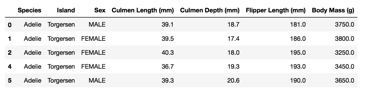
Once the data set looks organized and cleaned, we can move on to constructing a data visualization.
§5. Constructing a Data Visualization
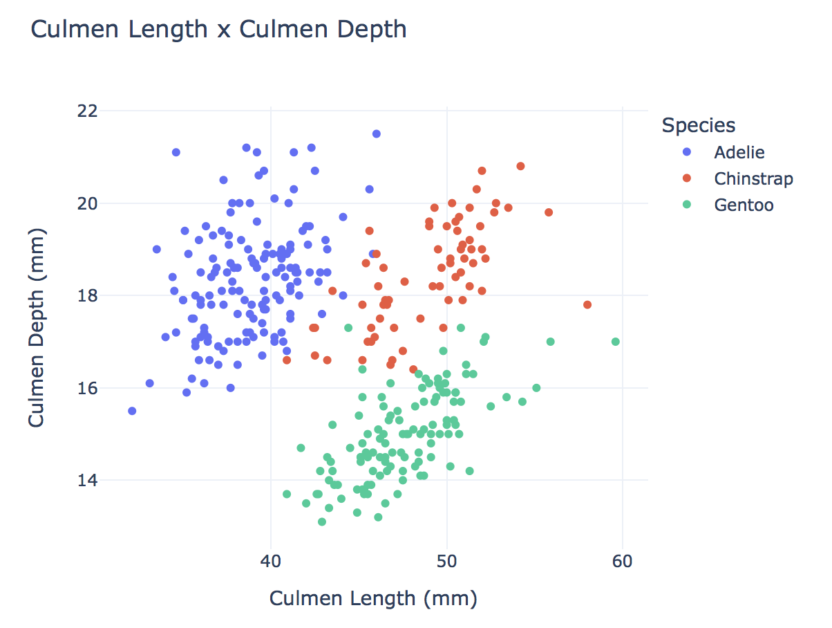
Here we will be constructing a scatter plot by running the following code:
fig = px.scatter(data_frame = penguins, # data that needs to be plotted
                 x = "Culmen Length (mm)", # column name for x-axis
                 y = "Culmen Depth (mm)", # column name for y-axis
                 color = "Species", # column name for color coding
                 width = 600,
                 height = 500,
                 title = "Culmen Length x Culmen Depth")

# show the plot
fig.show()
- Here we set up a scatter plot by collecting data from “penguins” that needs to be plotted.
- Then we set the x-axis to be the “Culmen Length (mm)” and the y-axis to be the “Culmen Depth (mm)”.
- Then we differentiated the species of penguins by color creating a legend.
- We also set an appropriate width (600) and length (500) of the scatter plot.
- We also established a title for our scatter plot.
- Finally, we showed the scatter plot.
§5. Final Data Visualization
Now, Let’s admire our scatter plot.